Cosmonaut Comfy
Aesthetic Essays #02
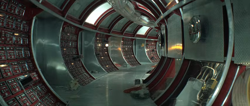
Image source: Solaris (1972)
Background
Growing up as a child of a unified Europe, I found myself between liberal and communist narratives, between glorified heroes, astronauts and cosmonauts. But it was only much later that I learned to identify and differentiate between them and their deeper implications. So in this essay, we will compare the aesthetics and anthropology of Soviet and western space explorers, look at how cosmonauts remain stuck in the past reality of Soviet cold war movies and examine why this fits their aesthetic quite well.

Scroll gallery to see more. Click on image to enhance.
Naming
Soviet Futurism and Soviet Retro Sci-Fi are already established terms in aesthetics communities. They overlap a lot with cosmonaut aesthetics, but the setting is vastly different. While futurist propaganda displays communist cities of the future, inhabited by the workers of the world and driven by fabulous means of transport, a cosmonaut is alone as a man can be and has nowhere to go. We have been promised the ideal tech utopia, but in the real world, where failed socialism has lead to record heights of individualism and loneliness, cosmonauts feels oddly more relatable.
Like all Soviet art, cosmonaut aesthetics are part of Socialist Realism, meaning that other than in American science fiction, the focus always remains on the human aspect. While Kubrick's 2001: A Space Odyssey (1968) is about technology and artificial intelligence, it's Soviet response Solaris (1972) is about human emotion and relationships, using the space station merely as a setting. In other Soviet movies like Planeta Bur (1962), a humanoid robot in a supporting role exists, but remains nothing but an emotionless tool, doing exactly what it's being told and even sacrificing itself.
In this movie, another supporting role is taken up by a female cosmonaut. She is competent and the movie never sexualizes her or makes a big fuzz about it, but she remains at the space station throughout the movie and almost gets overwhelmed by her emotions once, risking the entire mission. This was enough for Soviet press and officials to deem the movie as misogynist. But it wasn’t misogynist enough for a release in the United States yet. For "marketing purposes", the American version added entirely new scenes of lightly-dressed young women dancing in the water and the movie was rebranded as Voyage To The Planet Of Prehistoric Women (1968). I think that sums up the difference between Hollywood and Soviet sci-fi quite well.
In the end, it was the general calm vibe that made me come up with the term of “Cosmonaut Comfy”. Slow pacing and fantasy-like settings are what defines the atmosphere, as well as loneliness and isolation, amplified by the retro feeling it gained today.
Characteristics
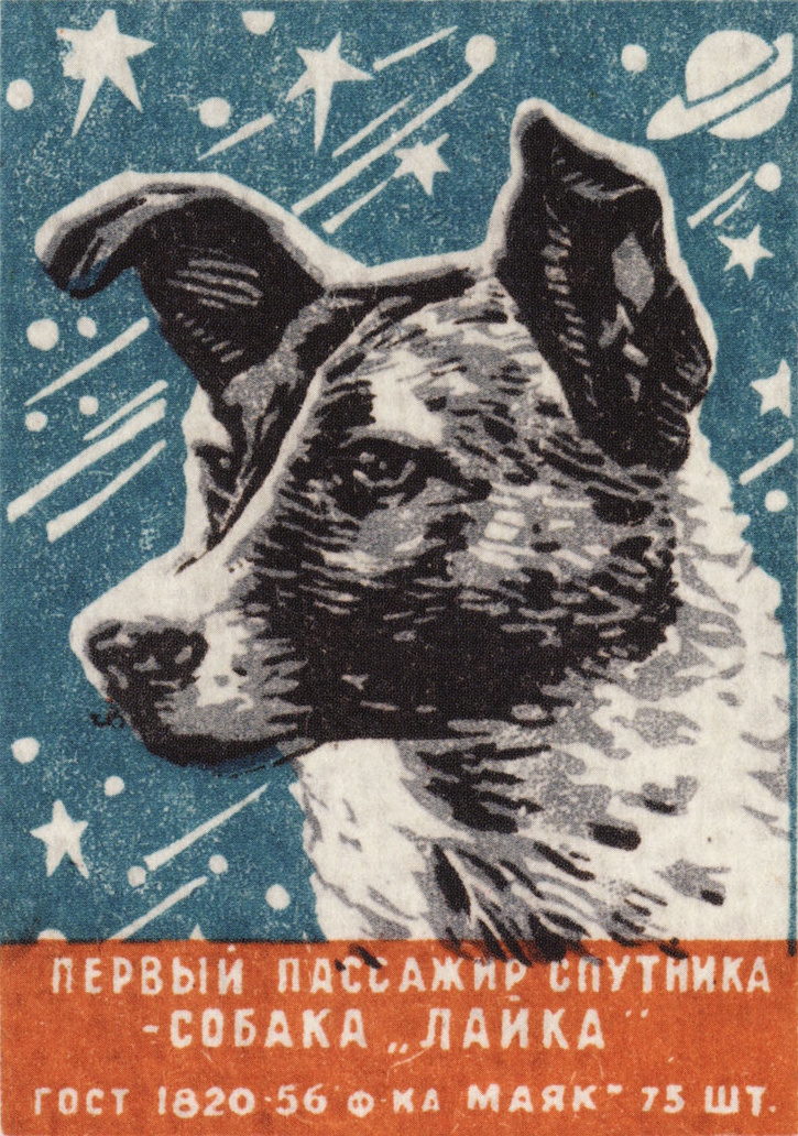
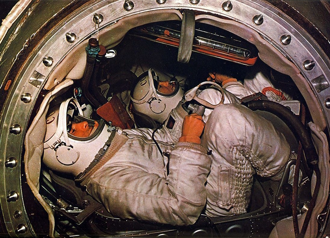
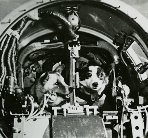
- Human and dog protagonists: according to Socialist Realism, all is centered around the workers, usually carrying tools or making gestures. Even the heroes are workers themselves, which is an inclusive world view: they are from different age groups and ethnicities, and among the heroes are, for example, female cosmonaut and former textile worker Valentina Tereshkova, and former stray dogs Belka, Strelka and Laika.
- Practical tech: contrary to radical minimalism and flat surfaces deemed modern in the west, cosmonaut spacecrafts are made for humans, by humans. They are full of small buttons, switches and light bulbs. There's no mysterious superhuman tech, it's all just human work.
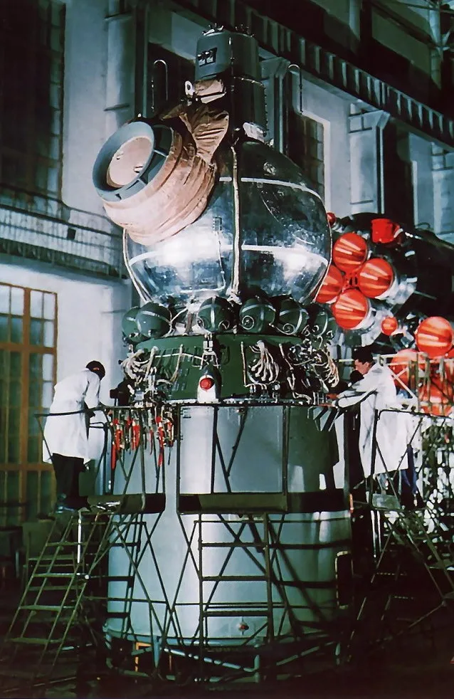
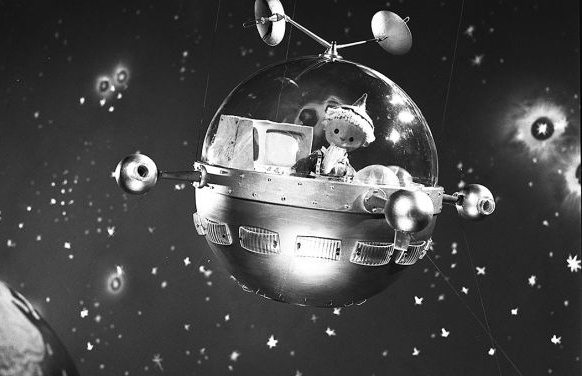
- Round, three-dimensional shapes: while western spacecrafts and satellites usually have a single “rocket shape”, Soviet ones are often times made up of different segments in the shapes of spheres, cylinders and truncated cones. Take the Soyuz space stations as an example, or the iconic Sputnik satellite that’s literally just a sphere with sticks on it. The same goes for the cosmonaut suits with their spherical helmets, and of course planets are spheres too.
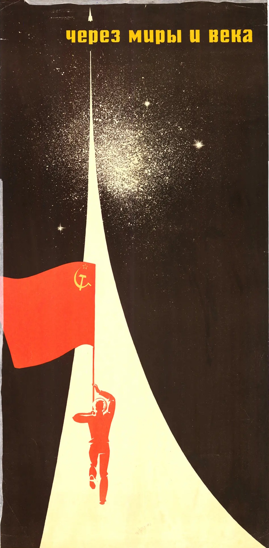
- Communist symbolism: mostly hammer and sickle, huge red stars and Soviet flags.
- Bold cyrillic typography: whether printed on machines or propaganda media, text is kept short and is printed in bold, blocky uppercase letters.
- Distinct colour palette: most surfaces are silver, some are white. Only rarely, elements have more practical looking colours like a greenish grey. Things that are supposed to stand out, like rocket engines, connection elements, seatbelts and of course the space suits bear a reddish orange. Important text and the Soviet flag wear a bolder red. On print media, dark blue and black are being used for contrast and the sky.
Appliance
I wouldn't be surprised to see Cosmonaut Comfy make a comeback soon. Ever since my research for this essay, it simply feels more relatable than western science fiction to me. The feeling of isolation creates an ideal setting for dealing with today's loneliness crisis and hyper-individualism. It’s focus on one individual or a small group of people exploring new things and finding beauty in the human nature offers a refreshing contrast to common dystopian sci-fi.
In that regard, it perfectly falls in line with other dreamy communist comfort fiction like Krtek or the Sandmännchen. Maybe online communists should try to revive these aesthetics instead of copying fascist video editing styles. We will need their comfy fiction once the new space race takes up pace thanks to billionaires and their private companies. Because "we" won't go to space to explore new worlds - the ultra-rich will go to evade taxes. So we have to dream.
Today, I imagine the best use case for a modern twist on Cosmonaut Comfy to be an AI chat bot. The mysterious sci-fi vibe fits well, and so does the idea of communicating only through text or speech. It would obviously have to be an emotionless AI that remains nothing but a servant to human, but dark backgrounds and stars are already popular in AI user interfaces. What’s missing are only bold silver and red elements with blocky typography to make things pop above.
This could also apply to regular chat rooms, error pages, system dashboards or other hidden menus; the entire “deep web”. Perhaps it even has a place in product design, since silver objects can really stand out. But they are also expensive to produce and hard to keep clean. So I will have to try out some things myself, and I’m looking forward to what all of you might come up with.
This text is part of our Aesthetic Essays series, where we discover and analyse niche aesthetics so you can use them for your own projects. To find out why we write these essays and under which criteria we select the aesthetics, read our Manifesto for an Aesthetic Warfare.