Competitive Maximalism
Aesthetic Essays #03
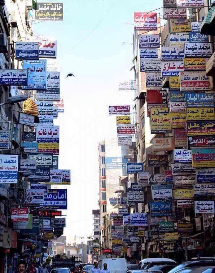
Image source: Rickard Törnblad
Background
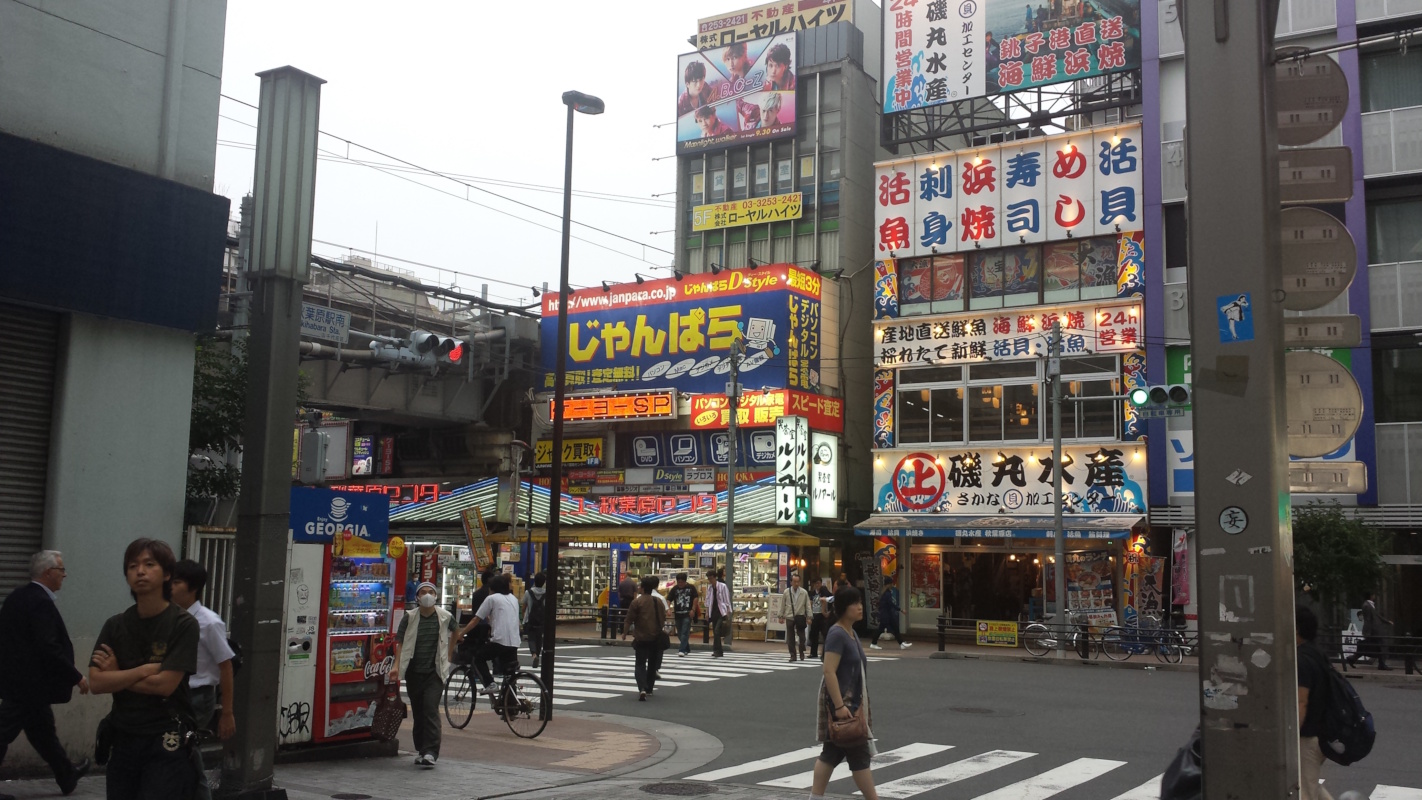
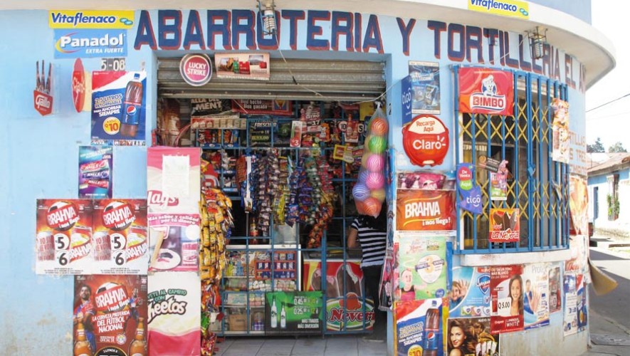
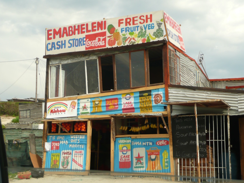
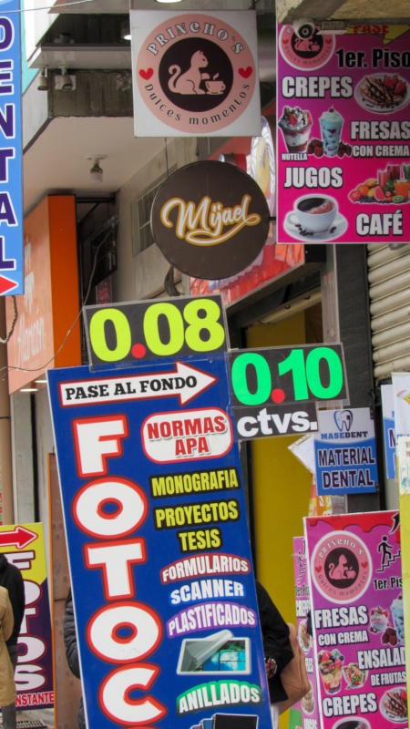
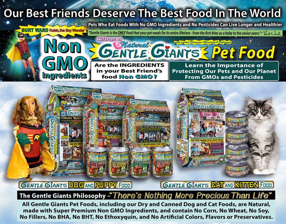
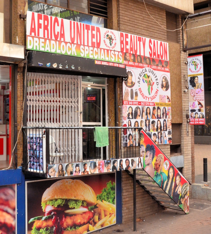
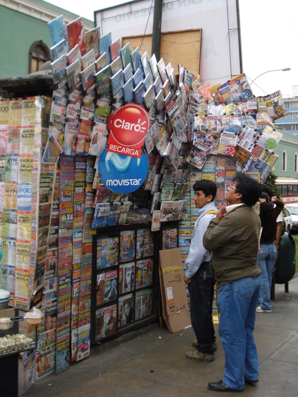
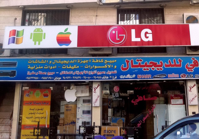
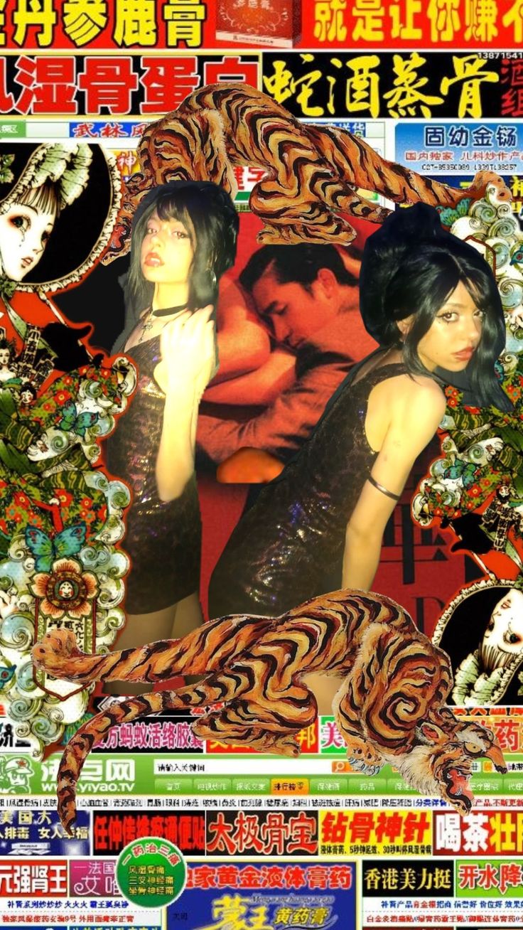
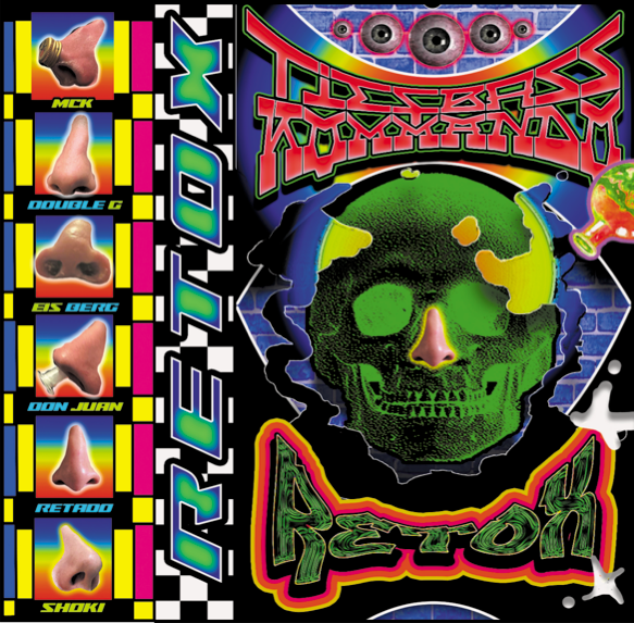
Competitive Maximalism is not an aesthetic you stumble upon randomly and instantly fall in love with. It’s a design philosophy, and it might even be the most common one on the planet. And it’s hard to find beauty and coherence in it. That is, outside of the global south, without street markets with brightly coloured plastic sheets as roofs, offering various foods from the region and textiles from abroad, cheap micro buses covered in stickers of popular logos and quotes, and equally eye-catching store fronts with displays filled to the brim. What made me personally fall in love though was the was the chaotic store signs fighting over my attention in all colours of the rainbow.

Scroll gallery to see more. Click on image to enhance.
Naming
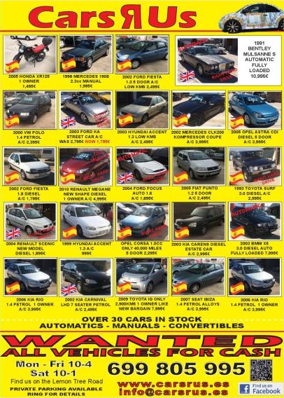
This type of design is pejoratively called “Dollar Store Vernacular” online on Pinterest and the Aesthetics Wiki (‘vernacular’ meaning something like ‘amateur’). It is being conceived through the glasses of westerers and the privileged, looking down at everything they associate with cheapness and unprofessionalism, throwing everything together that does not fit their own narrow-minded design principles. But bold colours, cramped canvases and cutout photos are simply not about dollar stores in North America. They have day-to-day status literally all around the globe, even including many subcultures in the west. Take retro-style websites, small corner stores, Asian super markets, firework packaging, techno and techno rap music covers, or even some of the funny quotes in your mum’s Whatsapp status as an example. In many of these cases, it’s being used semi-ironically and in full knowledge that it goes against dominant design principles. Similar aesthetics like hyperpop on the other hand have already learned to embrace this fact.
In short, most of it simply is not bad design: it communicates a brand’s products, cultural identity and price range extremely efficiently. There are talented artists and designers making a living off of it, breaking with colour theory, spacing or typography rules not because they wouldn’t know how to make something look smooth and pleasing, but because it simply is not their objective. Instead, their designs catch your attention even in a sea of competition, and survey a feeling of lavishness and excess. That’s what Competitive Maximalism means for me.
Characteristics
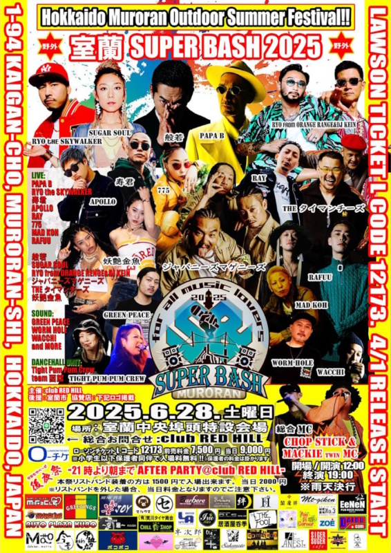
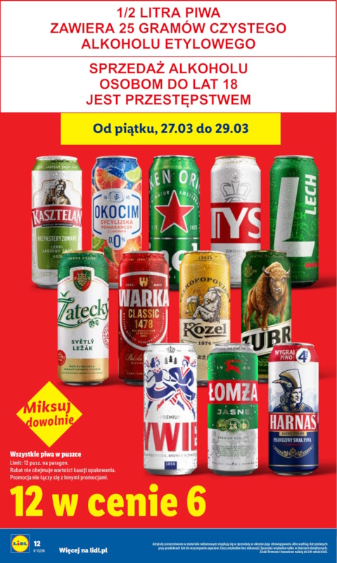
- Bold colours: Almost always, these designs use multiple of the primary colours red, yellow and blue. Lime and cyan are quite common as well. Often, black and white remain the most prominent colours, while some variants especially in South America barely even use them for outlines. Instead, they incorporate gradients like red-yellow, orange-yellow, or sometimes a rainbow-effect, purple-cyan, blue-cyan or yellow-lime. Either way, only one bold shade of each colour is being used.
- Flat visual hierarchies: usually there’s one large title and sometimes an image to look at first. The remaining elements show different features or products and have the same visual weight to another. Our eyes struggle to decide on what to look at first, creating a feeling of maximalism and excess.
- Floating photos: most images are photos with their backgrounds cut out, showing happy people or displaying products. On large canvases and walls especially in Africa, hand-painted images are common. Not all designs feature images.
- Uncommon, but clear typography: all headers and sub-headers make use of uncommon or slightly distorted fonts and have at least one outline, sometimes with gradients or 3D-effects. This increases the contrast to ensure high readability even from a distance. All letters are equally bold and uppercase, and share the same size and amount of detail and decoration.
- Little negative space: The canvas is full of elements, without much space to breathe. Spacing may however be used to establish a loose structure, and to make the main heading stand out.
Appliance
While the use cases for an aggressive Competitive Minimalism remain limited, some of it’s basic ideas can be applied to most areas. For example, super market catalogues make use of striking primary colours and few negative space, while still remaining a clear structure and shying away from gradients or letter effects. On the flip side, any styles or motifs can be incorporated into Competitive Maximalism itself. You can simply put soft, sharp, futuristic or historic fonts, drawings, 3D-models, doodles or abstract art into your work without it loosing it’s core aesthetic. This makes it an extremely flexible style.
The main lesson is to not be afraid of breaking conventions. My tip is to collect all the images and texts you want in one work space, scale and move things around until they fit into your canvas, and figure out the most striking letter effects and background colours afterwards. Ignore grids and do not add textures, shading or overlay. Make everything in a similar size and don’t crop anything off. Always keep in mind what you are working on and in which context it will be seen.
A more tricky question that shouldn’t go unmentioned is Competitive Maximalism’s potential as libertarian and anarchist aesthetic. Breaking with euro-centric and elitist ideals by rejecting design hierarchy and clear structure fits the philosophies of punk and dada quite well and could help the movement finally adapt a new visual identity. However, the extremely corporate nature of Competitive Maximalism cannot be ignored either and would be very hard to overcome.
Interestingly enough, Competitive Maximalism has no huge standing in social media either, even though attention is currency there just like in street markets. Perhaps it looks so much like an advertisement that many users just ignore it. Or it’s too complex and time-intensive for private accounts to pull off, while still being too chaotic and unconventional for professional social media teams. It doesn’t fit into a lot of large brand identities either, so for them it’s easier to play it safe and choose minimalist, brutalist or trending styles instead. But things are already slowly changing. Strict minimalism is on the decline, while more and more radical design styles are taking it’s place. Maybe now is the best time to take part yourself.
As I’m writing this in early 2026, some aspects of Competitive Maximalism are already being popularized online. Catchy fonts or bold colours are an easy way to shift away from minimalism. Gradients remain omnipresent since last year. And something called Index or Trinket Design made it into many designer’s trend predictions for 2026, which scales photos of large and small objects to the same size and puts many of them next to another on a blank canvas. It shows us that minimalism and maximalism are not always clearly differentiable, and that there is much more to explore in this field. So let’s get to it!
This text is part of our Aesthetic Essays series, where we discover and analyse niche aesthetics so you can use them for your own projects. To find out why we write these essays and under which criteria we select the aesthetics, read our Manifesto for an Aesthetic Warfare.